50 Predicting with Regression Multiple Covariates
50.1 Example: Predicting wages
# Load the packages
library(ISLR); library(psych); data(Wage)

# First we'll subset the data to remove the variable logwages for exploration purposes, as it's not part of what we're trying to predict.
Wage <- subset(Wage, select = -c(logwage))
Wage$region <- NULL
Wage$education <- as.factor(Wage$education)
Wage$jobclass <- as.factor(Wage$jobclass)
summary(Wage)
## year age maritl race
## Min. :2003 Min. :18.00 1. Never Married: 648 1. White:2480
## 1st Qu.:2004 1st Qu.:33.75 2. Married :2074 2. Black: 293
## Median :2006 Median :42.00 3. Widowed : 19 3. Asian: 190
## Mean :2006 Mean :42.41 4. Divorced : 204 4. Other: 37
## 3rd Qu.:2008 3rd Qu.:51.00 5. Separated : 55
## Max. :2009 Max. :80.00
## education jobclass health
## 1. < HS Grad :268 1. Industrial :1544 1. <=Good : 858
## 2. HS Grad :971 2. Information:1456 2. >=Very Good:2142
## 3. Some College :650
## 4. College Grad :685
## 5. Advanced Degree:426
##
## health_ins wage
## 1. Yes:2083 Min. : 20.09
## 2. No : 917 1st Qu.: 85.38
## Median :104.92
## Mean :111.70
## 3rd Qu.:128.68
## Max. :318.34# Getting training and testing sets
inTrain <- createDataPartition(y = Wage$wage, p = 0.7, list = FALSE)
training <- Wage[inTrain, ]
testing <- Wage[-inTrain, ]
dim(training); dim(testing)## [1] 2102 9## [1] 898 9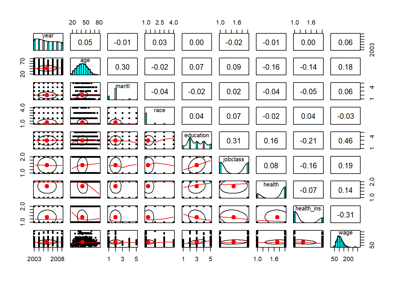
ggplot(data = training, aes(x = age, y = wage, col = training$education)) +
  geom_boxplot() +
  geom_smooth(method = "loess") +
  geom_point(alpha = 0.15) +
facet_grid(cols = vars(training$education)) 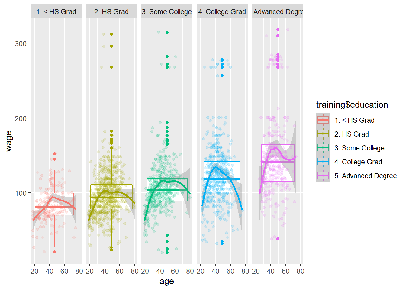
50.2 Fit a Linear Model
\[ED_i = \beta_0 + \beta_1(age)+ \beta_2 ~I(Jobclass_i = "Information") + \sum_{i=1}^4 \gamma_{K} ~I(Education_i = level_K)\]
# Train the GLM on the covariates; age, jobclass and eduction
modFit <- train(wage ~ age + jobclass + education, method = "glm", data = training)

# Create an object for the final model
finMod <- modFit$finalModel
print(modFit)
## Generalized Linear Model
##
## 2102 samples
## 3 predictor
##
## No pre-processing
## Resampling: Bootstrapped (25 reps)
## Summary of sample sizes: 2102, 2102, 2102, 2102, 2102, 2102, ...
## Resampling results:
##
## RMSE Rsquared MAE
## 35.7214 0.2425235 24.61777# Lets take a look at the regression diagnostic (Normal Q-Q Looks a bit fucked though)
par(mfrow=c(2,2))
plot(finMod)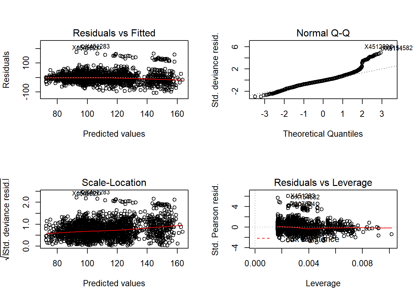
50.3 EDA in GLMs
Do we have any particular subsets that are especially fucked though?
This is particularly good exploratory technique. Look at the residuals vs the fitted plot and color by different variables.
ggplot(data = training, aes(x = finMod$fitted.values, y = finMod$residuals, col = education))+
  geom_point() +
  xlab("Fitted Values") +
  ylab("Residuals")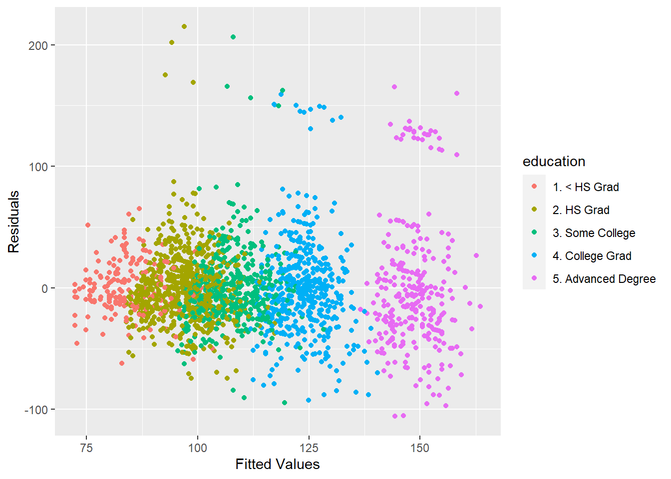
ggplot(data = training, aes(x = finMod$fitted.values, y = finMod$residuals, col = age))+
  geom_point() +
  xlab("Fitted Values") +
  ylab("Residuals")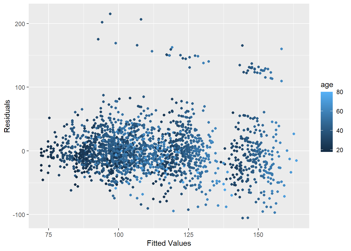
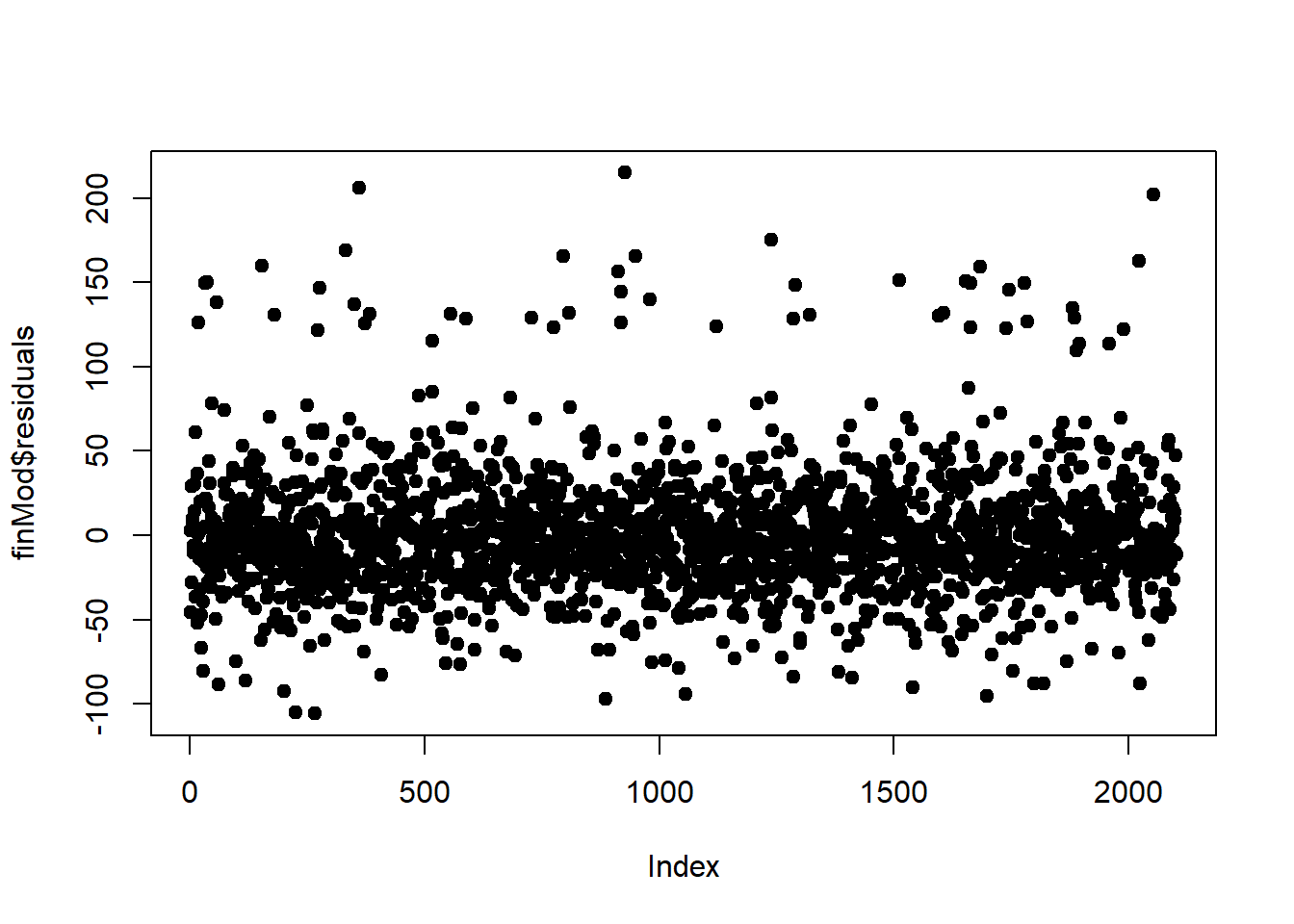
Another technique is plotting by index. Is there a certain point in the data where we start getting erroneous results?
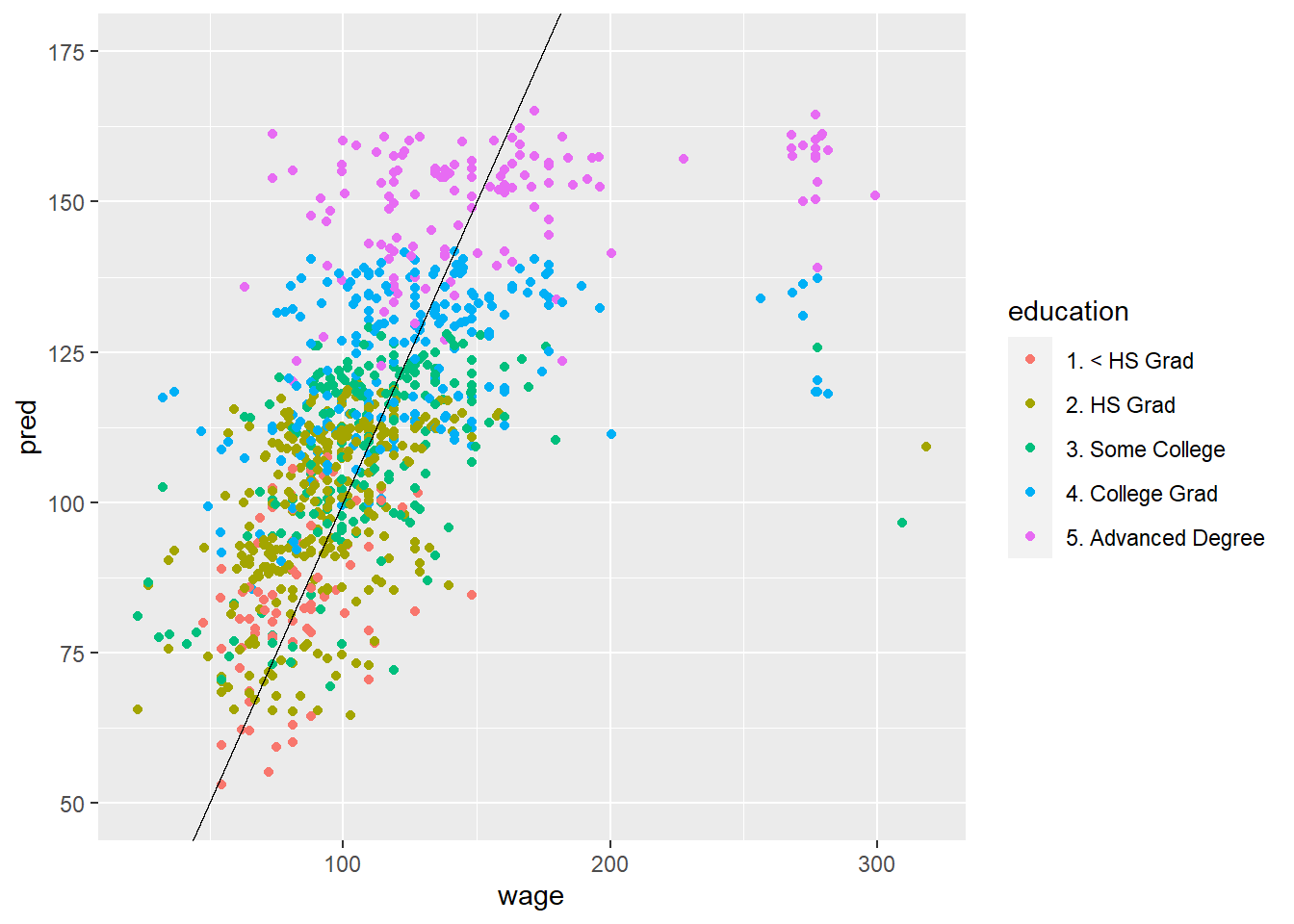
50.4 Predicted vs Truth in Test Set
# Using original model
pred <- predict(modFit, testing)
ggplot(data=testing, aes(x=wage, y=pred, col = education, )) +
  ylim(50,175) +
  geom_point() +
  geom_abline(slope = 1)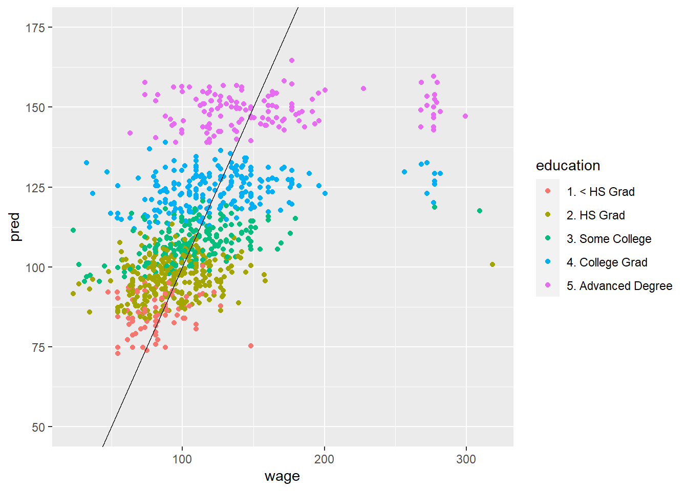
# Using model with all covariates (does a little bit better)
modFit <- train(wage ~., data=training, method = "lm")
pred <- predict(modFit, testing)
ggplot(data=testing, aes(x=wage, y=pred, col = education, )) +
  ylim(50,175) +
  geom_point() +
  geom_abline(slope = 1)