15 Permutation Tests
15.1 Group Comparisons
Consider comparing two indpendent groups. Example: comparing different bug sprays
- Consider the null hypothesis that the distribution of the observations from each group is the same
- Then, the group labels are irrelevant
- Consider a data frame with counts in one column and spray label in another
- Permute the spray (group) labels
- Recalcuate the statistic
- Mean difference in counts
- Geomatric means
- T-statistic
- Calculate the percentage of simulations where the simulted statistic was mroe extreme (toward the alternative) than the observed. This will create a permutation-based p-value.
15.2 Variations on Permutation Testing
Data Type, Statistic, Test Name
- Ranks, Rank Sum, Rank Sum Test
- Binary, Hypergeometric Prob, Fisher’s exact test
- Raw data, …, Ordinary Permutation Test
So-called Randomization tests are exactly oerutation tests, with different motivations.
- For matched data, one can randomize the signs
- For ranks, the results in the signed rank test
- Permutation strategies work for regression as well
- Permuting a regressor of interest
- Permutation tests work very well in multivariate settings
15.3 Permutation Test B v C
# Select sprays B and C
subdata <- InsectSprays[InsectSprays$spray %in% c("B", "C"), ]
# Set y as the outcome (counts in this case)
y <- subdata$count
# Set group as group labels
group <- as.character(subdata$spray)
# Test statistic here is just the difference in average between the two sprays
# Averaged out over batches
testStat <- function(w, g) mean(w[g == "B"]) - mean(w[g == "C"])
# The observed statistic here is just the test statistic applied to the outcome and group
observedStat <- testStat(y, group)
# Now we're going to resample the group labels to breka up any association between the outcome and the group labels and measure a test statistic 10,000 times
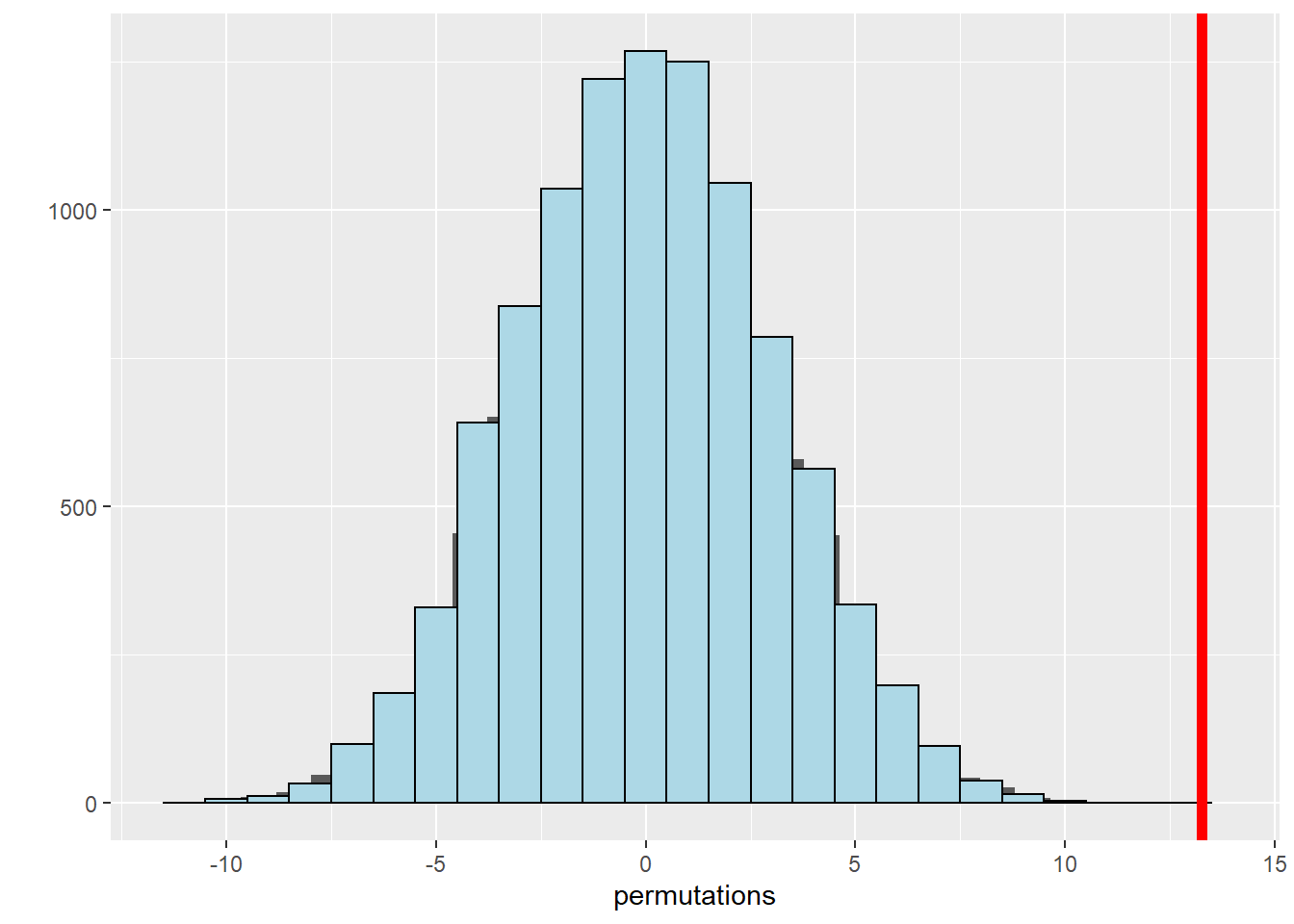
permutations <- sapply(1 : 10000, function(i) testStat(y, sample(group)))
observedStat## [1] 13.25# Calculate the percentage of permuted test statistics that are larger or more extreme, in favor of the alternative in our observed statistic
mean(permutations > observedStat)## [1] 0# Plotting a histogram allows us to see the distribution of permuted means. The red line indicates the observed mean from the original group
qplot(x = permutations) +
geom_histogram(color = "black", fill = "lightblue", binwidth = 1) +
geom_vline(aes(xintercept=observedStat),color="red", size=2)## `stat_bin()` using `bins = 30`. Pick better value with `binwidth`.